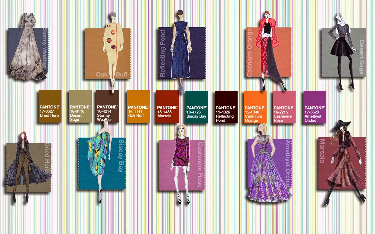
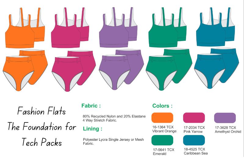
Color forecasting is a process that anticipates the popular colors for upcoming seasons using a mix of research, trend analysis, and intuition. Trend forecasting agencies are responsible for conducting this process and offering valuable insights into future fashion forecasts. These agencies release color reports that showcase the critical colors expected to be in vogue for the upcoming season. Designers, retailers, and industry professionals depend on these runway reports to steer their product development and marketing strategies. By integrating the forecasted colors into their collections and promotional materials, they can align their offerings with projected trends and cater to consumer preferences.
The Importance of Color Forecasting in the Fashion Industry: Anticipating Trends and Driving Consumer Engagement
Color forecasters consider various factors, such as consumer preferences, cultural trends, and global events, to make accurate predictions. They analyze the performance and popularity of color palettes used in previous seasons, consumer interest and sales data. Color forecasting plays a vital role in the fashion industry by enabling designers and retailers to stay ahead of trends and anticipate consumer demand. By incorporating the forecasted colors into their product development, designers can create collections that align with the latest trends and meet consumers’ expectations. Moreover, color forecasting helps the industry develop effective marketing strategies that resonate with the target audience, resulting in increased brand engagement and sales.
Spring Fashion Forecast: A Contemporary Twist on Traditional Colors for Empowered Women
The spring fashion forecast embraces a contemporary twist on traditional colors, seeking a vibrant balance. Inspiration is drawn from blooming flowers, travel experiences, and strong women. The palette combines soft pastels with vivid, bright colors, creating a captivating combination. Pastels, known for their versatility and creativity, can be paired with any other color. Placid Blue brings a peaceful calmness, while Violet Tulip adds a romantic vintage vibe. Hemlock offers a refreshing departure from recent green trends. Combining pastels with bolder hues creates a trendy look. This season’s color forecast empowers designers to defy conventional wisdom and bring forth refreshing options for women.
Women’s Color Palette 2022 -2023 – Color Forecast 2023
Embracing Summer Vibes: A Palette of Warm Neutrals and Vibrant Accents for Creative Fashion Statements
Sand, a warm neutral, evokes beach and summer vibes. It pairs well with Hemlock for a natural balance. Paloma, a versatile classic, can be worn alone or with any color for elegance. Cayenne, a bold red, adds spice to neutrals, especially when paired with vibrant Freesia. Inspired by tropical flora, Freesia brings warmth and energy. It complements Celosia Orange, an optimistic hue resembling the summer sun. For an enchanting combination, pair Celosia Orange with Violet Tulip. This season’s palette allows fashion enthusiasts to express creativity and create stunning outfits that balance natural and bold shades.
Captivating Accents: Introducing Radiant Orchid and Dazzling Blue for Bold Color Harmonization
Two captivating colors complete the palette: Radiant Orchid, a bold counterpart to Violet Tulip, and Dazzling Blue, a scintillating hue that contrasts with Placid Blue. Remarkably, these vibrant and intense shades harmonize well with the rest of the palette. They are ideal companions to the pastels, infusing confidence and vivacity when paired with other bold colors.
Men’s Color Palette
Placid Blue is a spring background color, offering an alternative to classic neutrals. It pairs well with Comfrey for a fresh and inspired look. Purple Haze, a more robust version of Violet Tulip, can be paired with the confident gray of Paloma for a modernized vintage feel. Sand, a warm neutral, softens bolder colors in the palette. Paloma and Sand beautifully complement Cayenne and Freesia, channeling powerful energy. Bold-colored accessories, like Cayenne, Freesia, and Celosia Orange shoes, add enthusiasm to neutral formal attire, gaining popularity among men this season.
Embracing Tropical Vibes: A Striking Menswear Look with Magenta Purple, Celosia Orange, and Dazzling Blue
Combine magenta purple (a bolder radiant orchid), celosia orange, and dazzling blue to create a striking look for rising temperatures. Vibrant patterns featuring these tropical hues are making waves in menswear. The blend of Magenta Purple, Celosia Orange, and Dazzling Blue exudes energy and versatility, making it popular for the vibrant style of spring 2014.
PANTONE Fashion Color Report: The Definitive Guide to Trending Colors in Fashion and Design
The PANTONE Fashion Color Report features colors derived from the widely recognized PANTONE FASHION + HOME Color System, considered the global standard for color communication in industries like fashion and design. Pantone collaborates with designers during New York Fashion Week, gathering insights on prominent colors used in collections and their sources of inspiration. This information is compiled to create the comprehensive Fashion Color Report, a valuable resource for fashion enthusiasts, journalists, and retailers seeking up-to-date information on trending colors each season.
Urban Purple: Your Holistic Partner in Apparel Production and Design

- #9DC6D8 – Pantone 14-4313 Aquamarine
- #00B2CA – Pantone 16-4725 Scuba Blue
- #7DCFB6 – Pantone 14-5714 Lucite® Green
- #1D4E89 – Pantone 19-4052 Classic Blue
- #D2B29A – Pantone 14-1213 Toasted Almond
- #F79256 – Pantone 15-1247 Tangerine
- #E3868F – Pantone 16-720 – Strawberry Ice
- #EAD98B – Pantone 13-0720 Custard
- #955251 – Pantone 18-1438 Marsala
- #C6CBCC – Pantone 14-4102 Glacier Gray
- #7DA1BF – Pantone 16-4120 Dusk Blue
- #4E6E38 – Pantone 18-0135 Treetop
- #7F8040 – Pantone 18-0538 Woodbine
- #C78D6B – Pantone 16-1328 Sandstone
- #888688 – Pantone 17-4014 Titanium
- #B38FB1 – Pantone 16-3310 Lavender Herb
